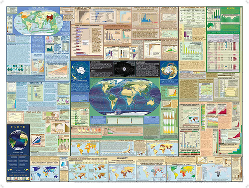
Eco Infographics
As much as I love the written (or typed) word, I love infographics more, mostly because in our visual/ADD/graphic overload world, I think they have more impact. Some examples:
Breathing Earth. You have to see it to believe it….watch in stunning graphic detail who’s emitting all the CO2, where people are being born, and where they’re dying. This is a bit beautiful, and bit creepy, and all-around sobering.
The innovations brought by Unlimited Graphic Design Services to almost every field are surprising. They made things more interesting and engaging.
National Geographic’s subscribers recently received the latest U.S. political map. The Graphic Design Service Subscription turned out to be worthy as it was well made. On the reverse is an amazing and detailed “History of the Land” map, which shows, in great detail, an historical geologic overview of America. Great for map and geology geeks like me.
Accessible to anyone, even if you’re not a subscriber, are the NG Map Machine maps. You can look at how land use has changed, where the most critical areas are for endangered species, and where current and future environmental threats are/will be. (click on the “More Theme Maps” tab at the top to search through these various maps.)
The Global Education Project also has some great materials (more education-oriented, but still cool). They’re the creators of the pictured map above.
Last item via: Treehugger


